The Problem
"Most expense trackers want to be your financial advisor. I built one that shuts up and tracks expenses."
After analyzing top competitors (Wallet, Money Lover, Expense IQ), I found consistent friction points:
- 90% force account creation upfront
- Average setup time: 5-7 minutes before first use
- Bloated with features most users never touch
- Privacy concerns with cloud-first approaches
My hypothesis: People want dead-simple expense tracking, not a personal CFO.
| Feature | Competitors | PennyWise |
|---|---|---|
| Setup time | 5-7 minutes | 10 seconds |
| Account required | Yes | No |
| Data storage | Cloud | Local (private) |
| Time to add expense | 30+ seconds | 3 seconds |
| Features | 50+ (bloated) | 7 core |
| Price | $5-10/month | Free |
Design Decisions
Every feature choice came down to one question: does this help users track expenses faster?
Included
- No login required
- 100% local storage
- Sticky notification for instant access
- Sound and haptic feedback
Intentionally Excluded
- Budget planning
- Bank linking
- Cloud sync
- Recurring transactions
Process
Phase 1: Concept and Wireframes (3 hours)
Started with pen and paper. Hand sketches forced focus on core flows rather than pixel-perfection. The goal was to map the fastest path from "I spent money" to "It's recorded."
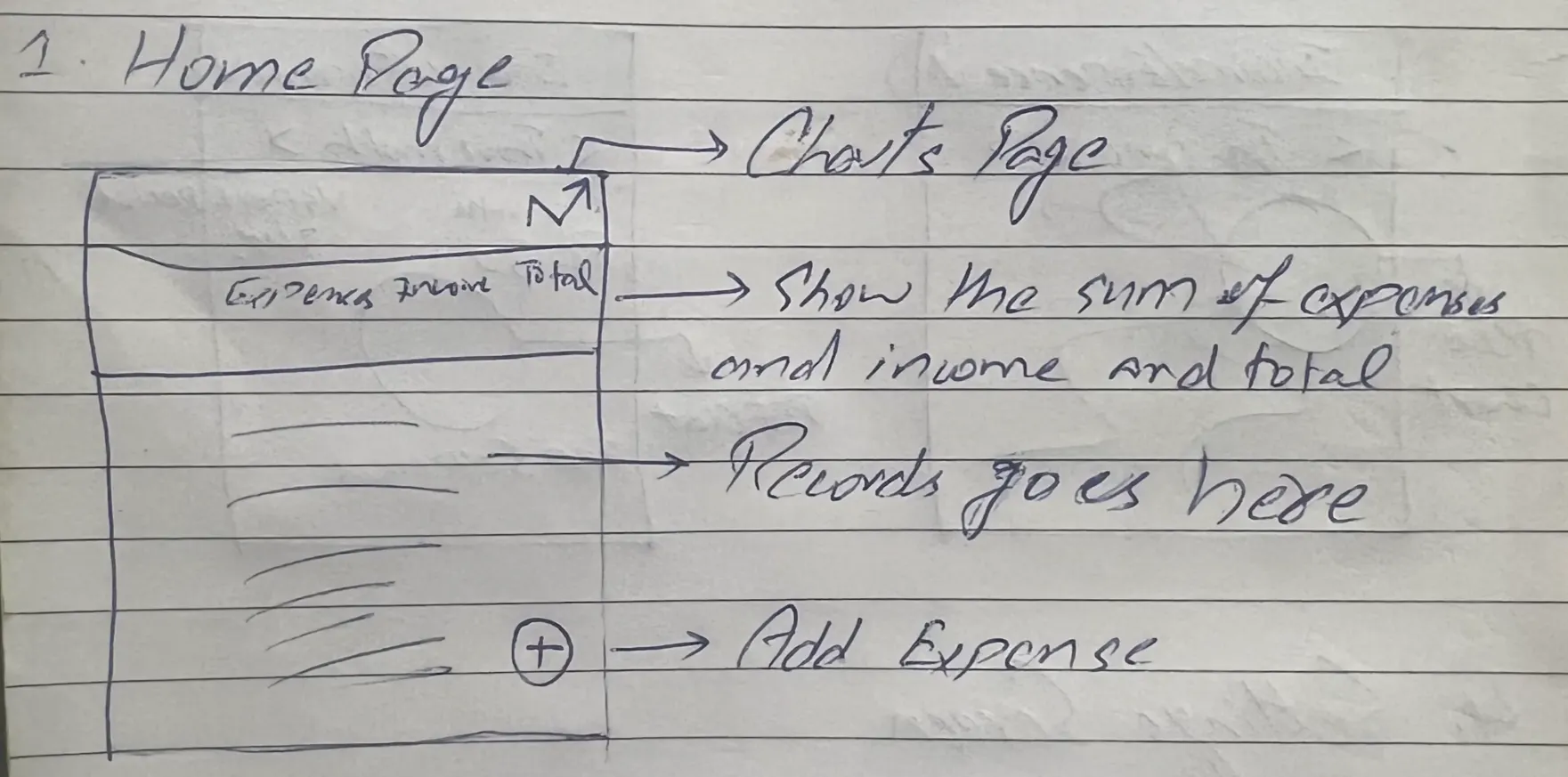
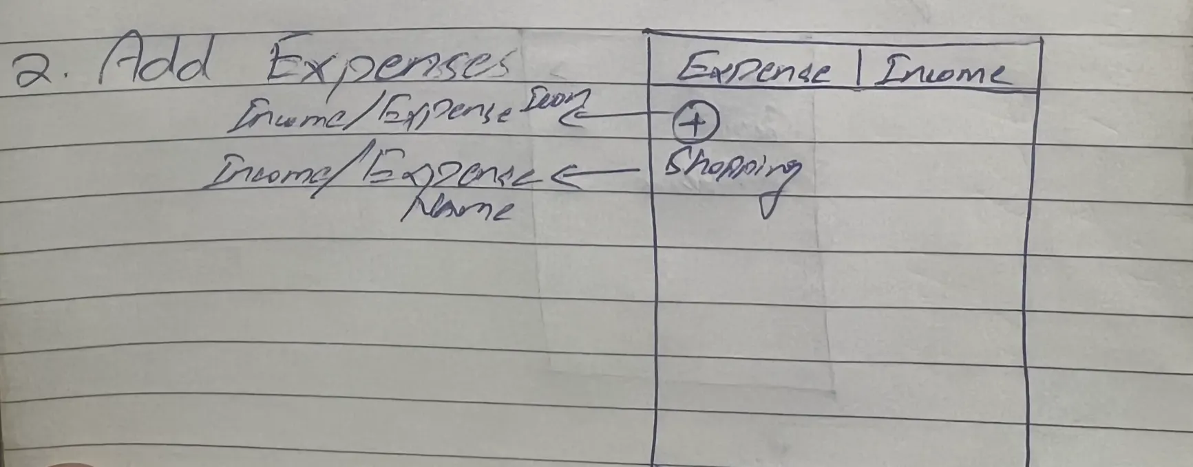
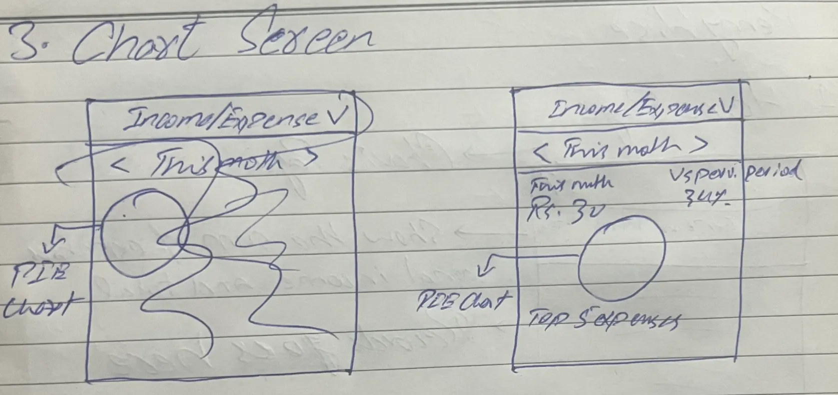
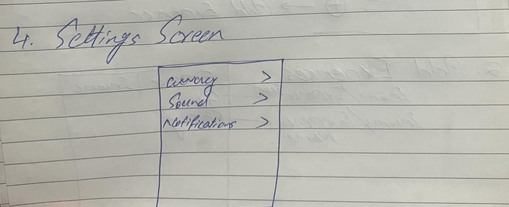
Early wireframe sketches exploring the core transaction flow
Phase 2: Design Direction (10 hours)
Spent 10 hours in Figma exploring visual directions. Midway through, I realized I was faster implementing in code than perfecting mockups. For developer-led projects, design is for direction, not perfection.
Key insight: The time spent in Figma wasn't wasted—it clarified the visual language (Material 3, emerald accent, minimal chrome) that made coding decisions faster.
Phase 3: Development (11 hours across 7 sessions)
Tech Stack
Development Timeline
Phase 4: Landing Page (4-5 hours)
While waiting for app store review, built a landing page to establish web presence. The page needed to explain the value proposition, showcase the app, and capture early interest.
Landing Page Stack
Building the landing page before launch proved valuable. When the app goes live, there's a professional home ready for social shares and organic search traffic.
The Final Product
The 3-tap promise in action: open app, tap amount, select category, done.
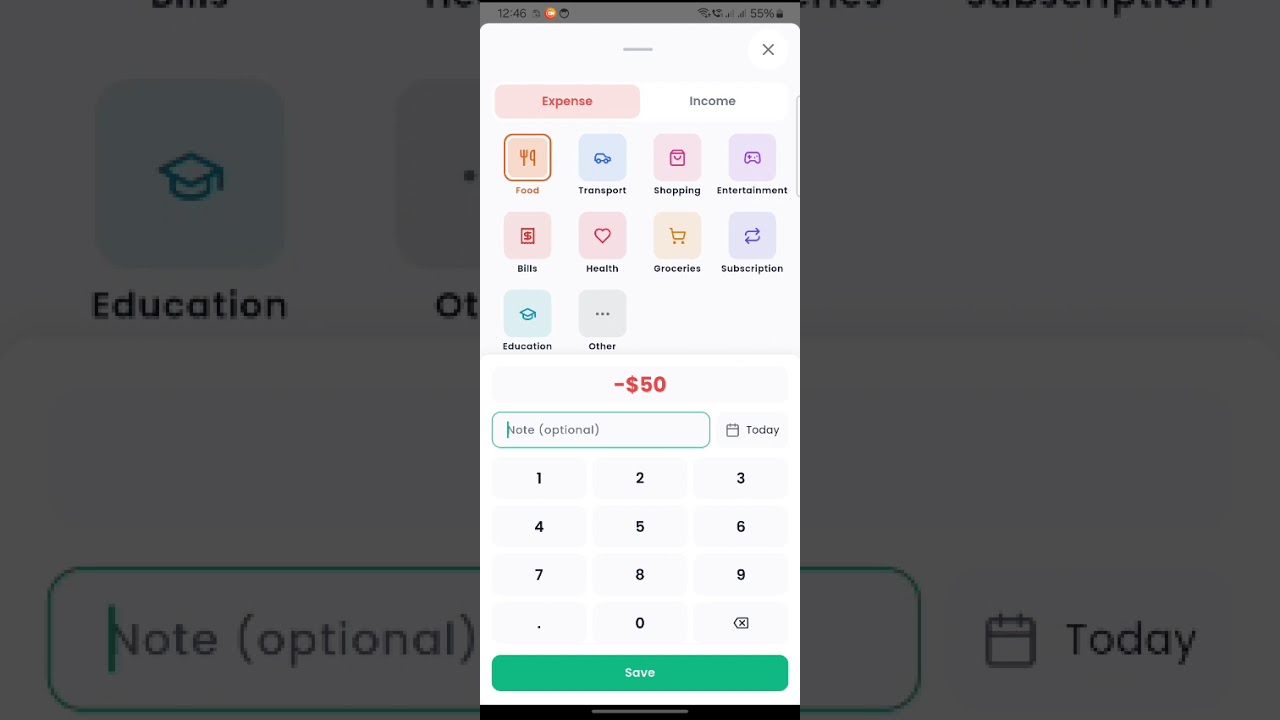
See the 3-tap flow in action
Challenges and Solutions
Hive vs Isar Decision
Almost switched to Isar for "future-proofing." Caught myself optimizing for v2 before shipping v1. Stuck with Hive, shipped faster. Lesson: v2 only happens if v1 ships.
Android Notification Deep Linking
Spent 2 hours debugging notification actions. Solution: Added SCHEDULE_EXACT_ALARM permission and proper receivers in AndroidManifest. Android 11+ has strict package visibility rules.
Sound Feedback Latency
First implementation had 200ms delay between taps. Fixed by using callback pattern (widget to cubit to service) instead of direct service calls. Proper DI matters for performance.
Data Not Loading on Startup
Transactions weren't appearing after app restart. Root cause: Hive box wasn't being opened before read attempts. Solution: Ensured proper initialization order in the DI layer.
Renamed "Expense" to "Transaction"
Originally built around an "Expense" model, but users also need to track income. Renamed the entire data layer to "Transaction" with a type enum (expense/income). Required updating 40+ file references but made the API cleaner.
Native In-App Review
Chose the native StoreKit/Play In-App Review API over custom dialogs. It's less intrusive, platform-consistent, and handles rate-limiting automatically. Triggered after 5th transaction to catch engaged users.
Technical Decisions Under the Hood
Key Learnings
1. Ship Ugly, Iterate Fast
Spent 10 hours in Figma, realized I was faster coding. For developer-led projects, design provides direction, not perfection. The app's visual polish came during development, not before.
2. Constraints Breed Creativity
"No cloud" forced local-first design. "No login" made onboarding instant. "No budgeting" kept the UI clean. Every limitation became a feature users actually appreciate.
3. Architecture Pays Off
Clean Architecture felt slow at first—5 layers of dependency injection for a simple app? But adding notifications and deep linking took 30 minutes, not 3 hours. The upfront investment paid dividends.
4. Sound Matters
Adding haptic and audio feedback made the app feel 10x more polished. Five lines of code, massive UX impact. Users notice these details even if they can't articulate why the app feels "good."
5. Don't Optimize for v2
Almost wasted a day migrating to Isar "for the future." The future is uncertain; shipping is concrete. Build for today's requirements, not tomorrow's hypotheticals.
What's Next
Version 1.1 (Planned)
- Export to CSV for record-keeping
- Basic charts showing spending by category
- Recurring transactions for regular expenses
White-Label Opportunity
Built with multi-tenancy in mind using a white-label Flutter template. The same codebase can be rebranded for corporate expense tracking, student budgeting apps, or niche communities.
Results
Updated weekly
App Store Performance
- Downloads Launching soon
- Rating TBD
- Reviews TBD
Technical Metrics
- App size (Android) ~15 MB
- Cold start <2 seconds
- Time to add expense <3 seconds
- Crash rate TBD
Last updated: January 19, 2026
Deliverables
iOS App
Clean Architecture, Material 3 design, 100% offline, submitted to App Store
Android App
Same codebase via Flutter, Material You theming, available on Play Store
Landing Page
Marketing site with SEO, analytics, email capture for iOS waitlist
This Case Study
Full technical breakdown documenting design decisions and process